 Cloud Engineer

mailsforsahan@gmail.com
© 2024 sahan. All Rights Reserved - Website powered by AWS Lightsail
Call Me!Business Intelligence (Tableau)
Harnessing Big Data Analytics: A Deep Dive into Data Analysis and Imputation Techniques
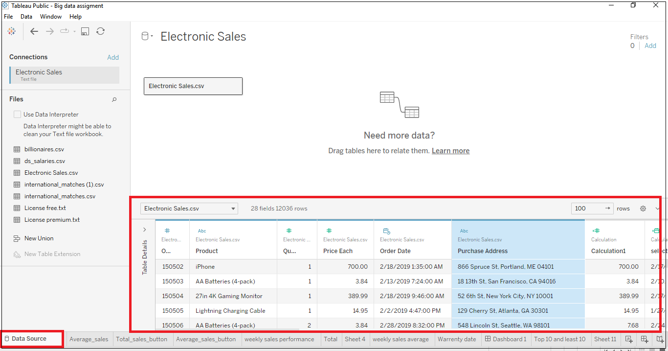
The dataset belongs to tech gadgets and product sales. The name of the dataset is Electronic Sales.csv. According to the dataset, it has multiple columns such as Order ID, Product, Quantity Ordered, Price Each, Order Date, and purchase address.
Step 01 – Open the worksheet by going to “File” and then “Open” then drag and drop the dataset.
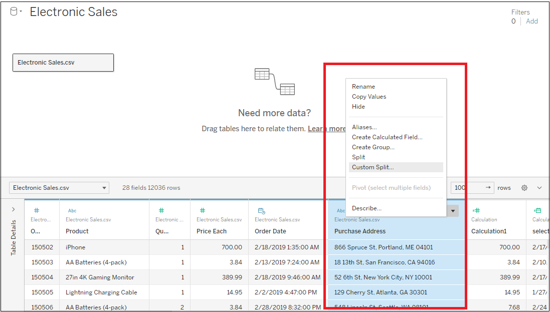
According to Figure 37 when a dataset is added to the tableau, the default location will be as Figure 37 and all the columns of the data will be visible right side of the dashboard. If the requirement is to select the country from the purchase address column, follow Figure 38, click the drop-down icon on the top right side of the column name, and select custom split separate which word to be separated and create a new column.
Task 01
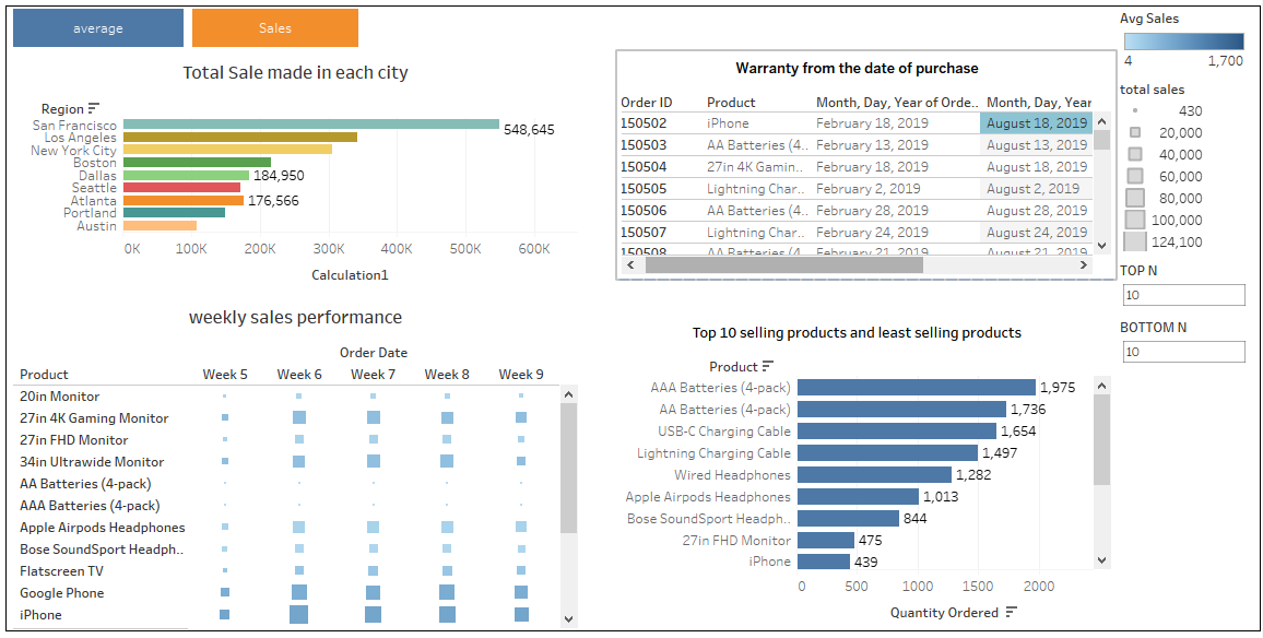
In This task, the visualization illustrates the top 10 selling products the and ten lowest-selling products using the parameter function to filter the data according to the customer requirement.


Task 02
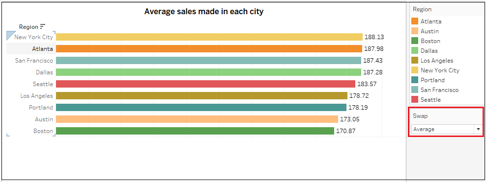
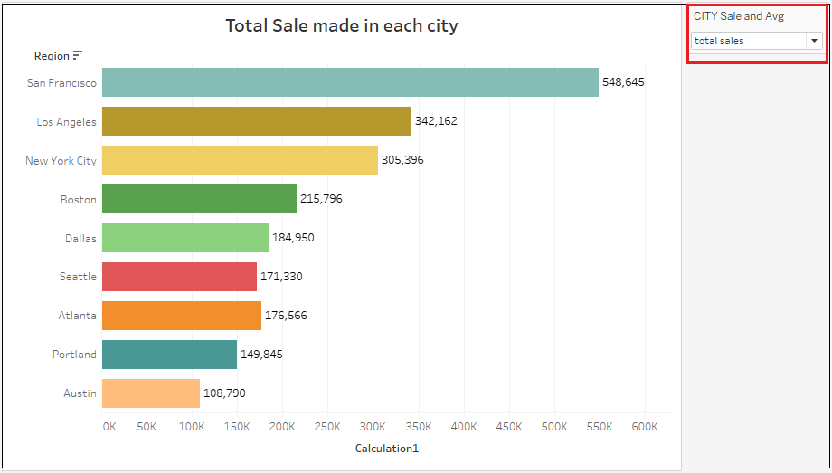
Using an appropriate chart, display the Total/Average sales made in each city. The chart should allow the user to switch between the Sum and Average Sales. Place the result in descending order. Here, there is a new parameter created as swap, and in that parameter, it is defined as average sales and total sales. Once the parameter is created, the next step is to right-click the parameter name and select and show the parameter to display the filter on the right-side.

Task 03
According to this sheet, the order date format is changed to weekly, so the sale has been grouped into weekly columns. The right side of the graph shows the filer method, if the total sale is very high the rectangle is bigger and when the total sale is less, the rectangle is smaller. When it comes to average, the highest is dark blue and the lowest is light blue in color. According to the sheet, the MacBook Pro laptop’s average sales and total sales are very high each week.

Task 04
According to this sheet, people who order the product have six months of warranty. In this task, from the ordered date it shows which date the product warranty will be expired.


Tableau Dashboard
Using the Tableau dashboard, raw data can be visualized into advanced data visualization charts. In this dashboard, there are four sheets combined. The top left sheet represents the total and average sales in each city and in that sheet, there are two buttons on the top of the sheet to switch between average and total sales. The left bottom sheet represents the total and average sales in each city. The top right sheet represents the warranty period that is left for the product. From the purchase date what date will the order expire. Lastly, in the bottom right sheet analyze the top 10 sleeping products and least selling 10 products all the time.
